Dashboard Studio
Administrators use Dashboard Studio to set up the Dashboard page that users see after signing in and that functions as a home page.
Dashboard Studio in design mode:
Tile types
An admin or advanced user customizes the look and the content of a Dashboard by selecting, positioning, sizing, and defining properties for the following dashboard tile types.
Note: The dashboard grid is ten squares across; the number of squares down is unlimited.
-
Workflow Tasks

Shows the user's assigned tasks. Users can click tasks to open them directly. You can specify the sort order, the number of tasks to show, and any or all of the following task statuses: In Progress, Past Due, Finished, and Future.
-


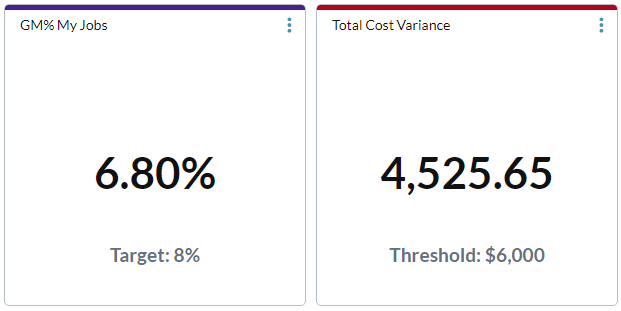
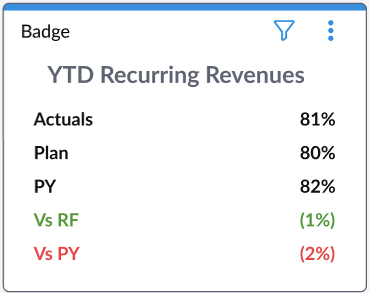
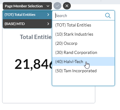
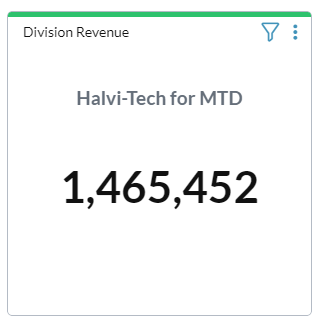
Shows one-or-more data points derived either from a data view that you specify, or a fixed numeric value(s) that you provide, and in the format that you select. A Badge tile can display up to 15 values.
If the data view has page dimensions, you can optionally add selected page dimensions to the badge. In the dashboard, your users can change the member combination, thus making the badge interactive.
-
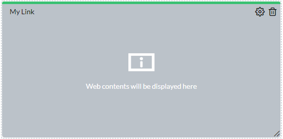
iFrame


Shows the website for the URL that you specify.
-
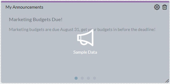
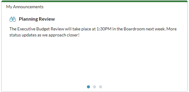
Announcements


Announcements are brief messages that appear in every user's Dashboard page and thus enable administrators to communicate with their users. The Announcements tile shows a set number of the current announcements, in rotation. Announcements can have attachments, which users can open by clicking .
-


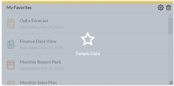
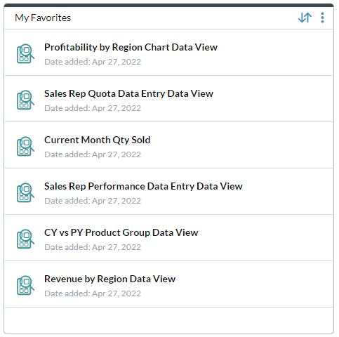
Shows a set number of the documents that the user has favorited for quick access. The favorites are sorted and ordered, as specified in the object's properties. The user also has the option of sorting the favorites from within the tile. Sorting options include Added by, Date added, File name, File type, and Last accessed. Users can click favorites to open them.
-


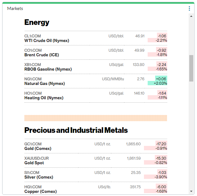
Shows a custom chart, derived from a specific data source, and may include a chart insight—a brief written/audio description of a chart's purpose, along with a summary of its data.
If the data view a chart is based on has page dimensions, you can optionally add selected page dimensions to the chart. In the dashboard, your users can change the member combination, thus making the chart more flexible.
-


New! Shows an interactive data table, derived from a data view. A Table tile presents detailed, multi-dimensional data in rows and columns—similar to a report grid—while maintaining dashboard interactivity.
You can:
-
View live data from models or reports
-
Expand to full window size
-
Apply filters and sorting
-
Drill down into underlying data for deeper analysis
-
Customize layout, formatting, and data refresh behavior
-
Open the table in Ad Hoc Analysis
-

Open Dashboard Studio
Administrators use Dashboard Studio to set up the Dashboard page that users see when after they sign in and that functions as a home page.
Open Dashboard Studio from anywhere
- Click the logo at the top-left corner and select Dashboard Studio.
Open a dashboard from Document Explorer
-
In Document Explorer, select a dashboard file (Db) and select Actions > Design Mode.
Tip: Document Explorer also provides options for viewing dashboards, as well as allowing users to set and reset assignments.
Create a dashboard
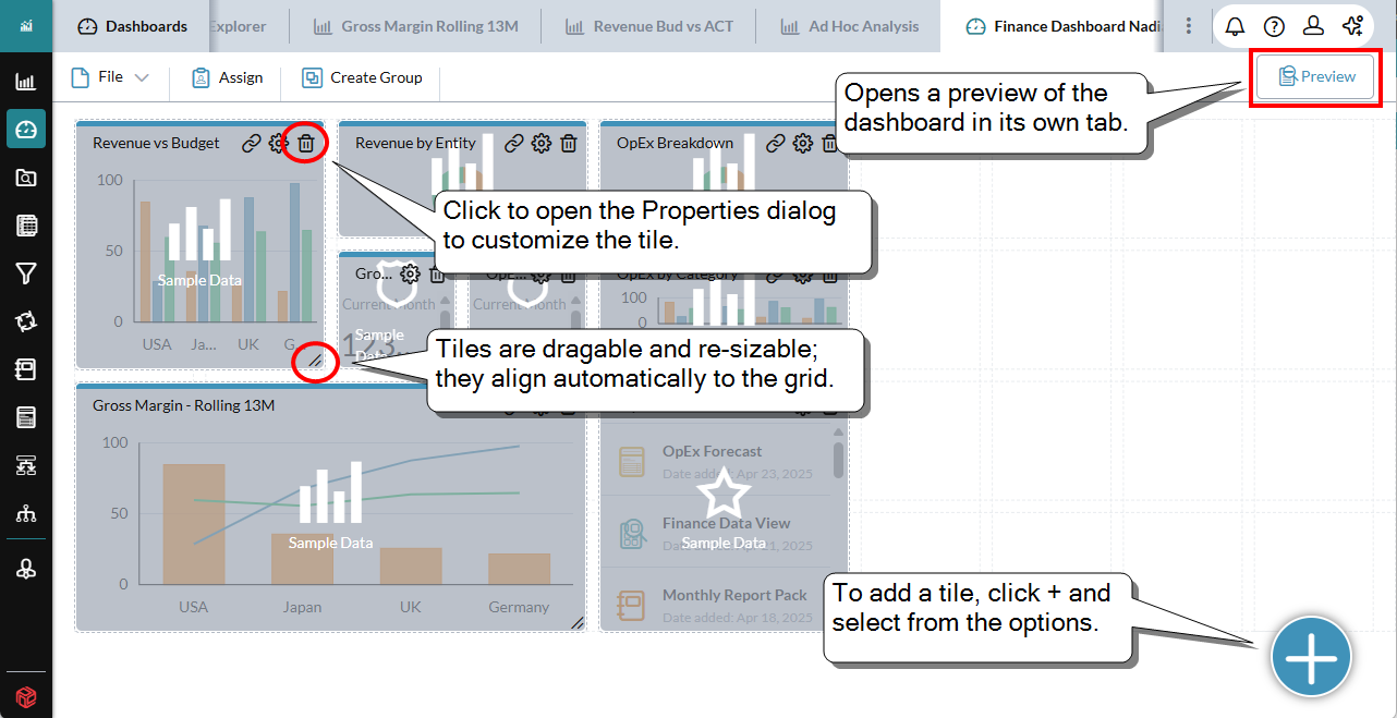
After you open Dashboard Studio, you are presented with a blank dashboard and you can start adding tiles.
-
At the bottom-right corner of the screen, click and select the tile type.
The tile is added to the dashboard.
- Do any of the following:
- To reposition the tile, drag it.
- To resize the tile, click and drag the bottom-right corner of the tile.
- To remove a tile, click in the title bar.
- To define the title, color, and unique properties of a tile, click . The tile's Properties dialog opens.
-
In Title, type up to 50 characters.
-
(Optional) To hide the title both in Preview mode and when users run the dashboard, click . (To reveal it again, click .)
Tip: Some dashboard designers find it helpful to see the titles during development in order to tell tiles apart. On the other hand, when the dashboard runs, in some cases you may want to hide the title.
Example: In a chart tile there may be a chart title, making the tile's title redundant.
- From Titlebar color, select a color for the title bar.
- The remaining properties depend on the tile type. To learn about them, see the sections below on the different tile types.
- To add more tiles, repeat the above steps.
-
At any time, to preview the dashboard click Preview. The dashboard opens in a new tab and uses live data.
To close the preview tab click .
Tip: You can keep the preview tab open as you develop the dashboard; click to update the preview tab with your changes.
- (Optional) You can create a group of two or more tiles. The tiles in a group share page member filters. (You can also group tiles later.)
- To save the dashboard, select File > Save or Save as.
When you are satisfied your dashboard is complete, you can assign it to users or groups. (But afterward you can still make changes to it.)
Manage dashboards
In Dashboard Studio, you can open and edit an existing dashboard or create a new one.
Open a new dashboard
- Select File > New.
Edit a dashboard
- In Dashboard Studio, select File > Open and browse to the dashboard file.
- In Document Explorer, select a dashboard file (Db) and select Actions > Design Mode.
Open the settings of a tile
- In the tile, at the top-right corner, click .
Share a dashboard link
New! You can securely share the URL of a running dashboard with other users.
The Share Dashboard feature creates a secure link. When a recipient clicks the link, the dashboard opens in the context of the recipient’s Security Manager permissions, enforcing data visibility restrictions and maintaining data privacy and access control.
Note: If the recipient lacks access permission for the File Manager folder that contains the dashboard file, clicking the link results in a message stating that access is denied.
If a user has no access to the dashboard file because of folder security, they will receive a message:
-
At the dashboard's top-right corner, click .
The Share Dashboard dialog opens.
-
Beside Selected user(s), click .
The User Selector dialog opens.
-
Move the names of the user(s) you want into the list on the right and click OK.
-
Optionally, in Description add any notes that you want to share with the email recipient(s).
-
Do one or both of the following:
-
To copy the URL to the clipboard, click Copy Link. You can paste the secure link into an email or chat.
-
To send an email to the select user(s), along with the secure link and whatever you added to Description, click Share.
-
-
To close the dialog, click Cancel.
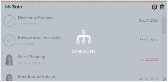
Workflow Tasks tiles
A Workflow Tasks tile shows the user a list of assigned tasks, and the user can click > to open a task in Workflow.
Define the content of the tile
You control how workflow tasks are presented using the following options:
-
Sort order
Select the task attribute the user prefers for sorting the list of tasks.
-
# of tasks (1-100)
Specify the maximum number of tasks to show in the object.
-
Show task status
To filter the tasks that the user sees, turn on/off the Status types.
Note: When running the dashboard, the user has the option of changing the task status filters.
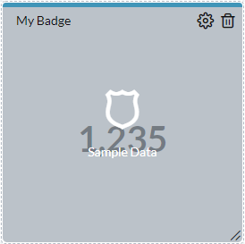
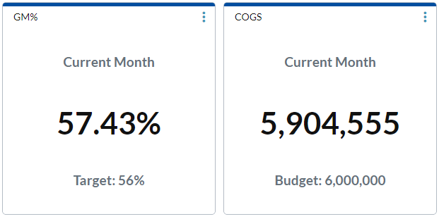
Badge tiles
New! A Badge tile shows up to 15 data points, which can be static (you type it in) or dynamic (pulled from a data view).
Do the permissions assigned to users affect what they see in a badge?
Yes. When the badge opens, it shows the first member combination(s) that the user has permission to see.
Define a badge that uses a static value and text
- Type a Title for the tile and select a Titlebar color.
- In Data Source, select Fixed Value.
- To set the Font size: Manual - use the slider, Auto-fit to tile size - proportionally scaling badge tile text whenever the tile is resized.
- (Optional) In Description Titles, you can add static text to help describe what the tile shows:
- To add static text above the Value, click Top text and type the Text.
- To add static text beneath the Value, click Bottom text and type the Text.
- Use the slider to set the Font size.
- To add the static value, in Value 1, complete the following:
- Type the Label that identifies the value.
- Type the Value that you want the badge to show (up to 10 digits).
- Select the Number format to apply to the Value.
- To allow color coding of the value (green for positive, red for negative), turn on Conditional format.
-
(Optional) For each additional static value you want to add, click + Add new value and repeat the previous step.
Note: A Badge tile can have up to 15 values.
- Click OK.
Define a badge that uses live data
You can connect a badge to a data view to provide the data point(s), and optionally, descriptive labels through Auto Text.
Note: Using this option, in the dashboard the user will have the option of clicking > to open the data view in Ad Hoc Analysis.
- At the tile's top-right corner, click .
- Type a Title for the tile and select a Titlebar color.
-
In Data Source, select Data View.
Note: The values you add below (Value 1, Value 2, and so on up to Value 15, are drawn from the first column of the data view, starting from the first row.
- Click and choose a data view.
- To set the Font size: Manual - use the slider, Auto-fit to tile size - proportionally scaling badge tile text whenever the tile is resized.
- (Optional) In Description Titles, you can add text to help describe what the tile shows. Do one of the following:
- To add static text, for Type accept the default (Custom) and do any of the following:
- To add static text above the Value, click Top text and type the Text.
- To add static text beneath the Value, click Bottom text and type the Text.
- To set the Font size, use the slider.
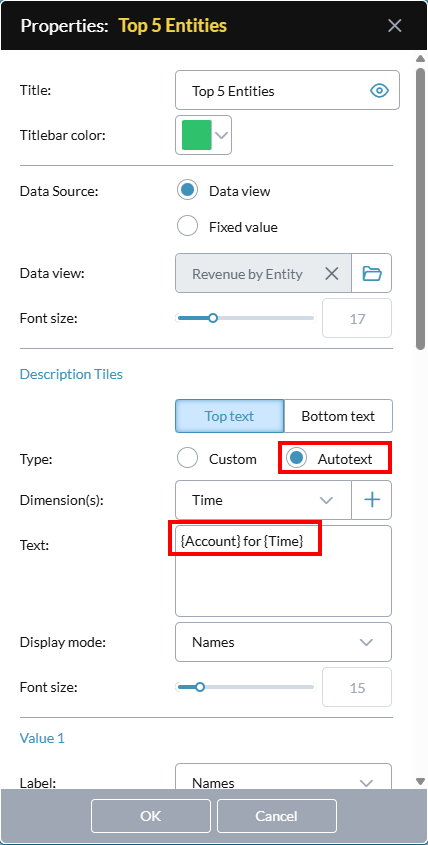
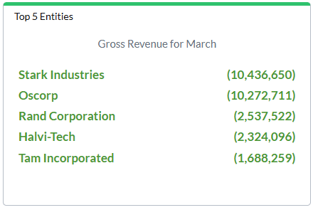
- To add dynamic text that shows a page member combination from the data view, for Type select Autotext. (This option is only available when the data view has page dimensions.) Do the following:
From Dimension(s), select each dimension that you want to add and click .


- From Display mode, select the dimension attributes you want the badge to show.
- To set the Font size, use the slider.
- To add static text, for Type accept the default (Custom) and do any of the following:
- To add the data value, in Value 1, complete the following:
- From the Label drop-down, select the dimension attribute(s) you want the badge to show, or select Custom Text and type the label text in the box that appears.
- Select the Number format to apply to the value.
- To allow color coding of the value (green for positive, red for negative), turn on Conditional format.
-
(Optional) For each additional static value you want to add, click + Add new value and repeat the previous step.
Note: A Badge tile can have up to 15 values.
-
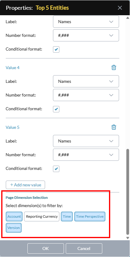
(Optional) For Page Dimension Selection click dimensions to add to the badge. (If this section does not appear, the data view has no page dimensions.)

When the dashboard runs, the user can click to open a menu of page dimensions and their members:
Note: In Preview mode the Page Dimension Selection drop-down appears but does not function.
Tip: A badge with selectable page dimensions is more flexible and thus can be useful to more users; this can reduce the need for separate badges/dashboards for individual users.
- Click OK.
iFrames tiles
An iFrame tile allows the user to launch a web page within the frame.
Specify a web page for the iFrame
-
In URL, type the address of the web page.
Note: You must specify a secure website (that is, one that uses https). Secure websites are now the Internet standard and prevent scripting attacks both on themselves and on the FP&A Plus application.
Tip: When running the dashboard, the user can open the target web page in its own tab, by clicking > .
Announcements tiles
An Announcements tile shows users the current messages, in a slide show format.
Define the Carousel Options
Change any of the following:
-
Show image
(Optional) You can have a random icon display with each announcement. Click to turn on/off the display of icons.
-
# of Items (1-10)
Select the number of announcements to include.
-
Display order
Select the order you want announcements to appear in.
Favorites tiles
A Favorites tile shows a list of up to 100 of the documents the user has favorited. When the user clicks a document, it opens in its own tab. If the user clicks > , Document Explorer opens, with My Favorites selected.
Define the Carousel Options
Change any of the following:
-
Sort field
Select the attribute to use for sorting the favorites.
-
Sort order
Select whether the Sort field uses ascending or descending order.
-
# of Items (1-100)
Select the number of favorites to include.
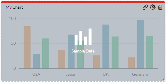
Chart tiles
A Chart tile shows a custom chart derived from a data view.
Tip: When working with charts, it helps to understand the terminology.
Link a template to a chart (Optional)
Optionally, a chart can be linked to a template file. The dashboard user can open the template to see related data.
-
At the tile's top-right corner, click .
-
Click and select the template.
-
Map the page members.
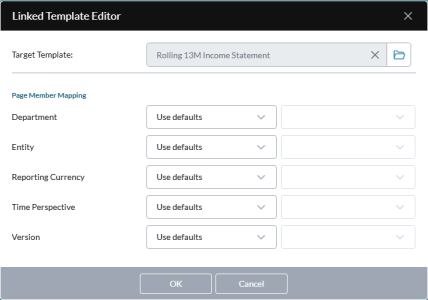
For each member, choose one of the following options:
-
Use defaults
The template uses its own built-in logic to determine what member to select.
-
Runtime Selection
The template selects a member based on what the user has selected in the chart.
-
Specific Member
The template uses the member that you specify. Click and select the member.
-
- Click OK.
Define a Chart tile
- At the tile's top-right corner, click .
- Type a Title for the tile and select a Titlebar color.
-
Connect the chart to its data source: click and select the data view. The chart is immediately drawn, using the default chart style and color scheme.
-
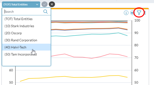
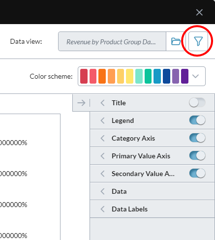
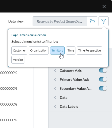
Optionally, add selectable page dimensions to a chart: click , and click each dimension you want to make available to the user; to close click . (If the icon is dimmed that means the data view has no page dimensions.)


Tip: The page axis in some data views includes an alternate hierarchy, and you can select it just as you would a dimension. The alternate hierarchy appears as dimension name.hierarchy name; for example: Organization.Legal.
When the dashboard runs, the user can click to open a menu of the selected page dimensions and their members:
- Optionally, if you have styles available select from Applied style. To learn more about styles, see below.
-
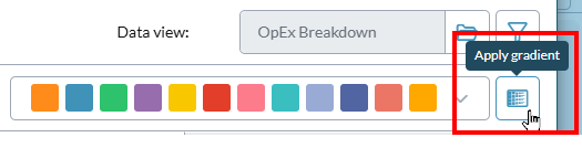
Optionally, you can select a Color scheme and also turn on the color gradient option:
- Select the chart type: open the left tray. You can freely select different chart types and sub-types and view the result.
- View and turn on chart elements: open the right tray. Click to show or hide an element.
- Edit chart elements: beside the name of the element, click to open the properties drawer. Most properties are self-explanatory. If you change a property, the result instantly appears in the chart.
- To add a secondary axis: in the Data drawer, from Series select the data series that you want plotted on the secondary axis, and click . (A secondary value axis measures a second data series, and is set parallel to the first value axis.)
- Click OK.

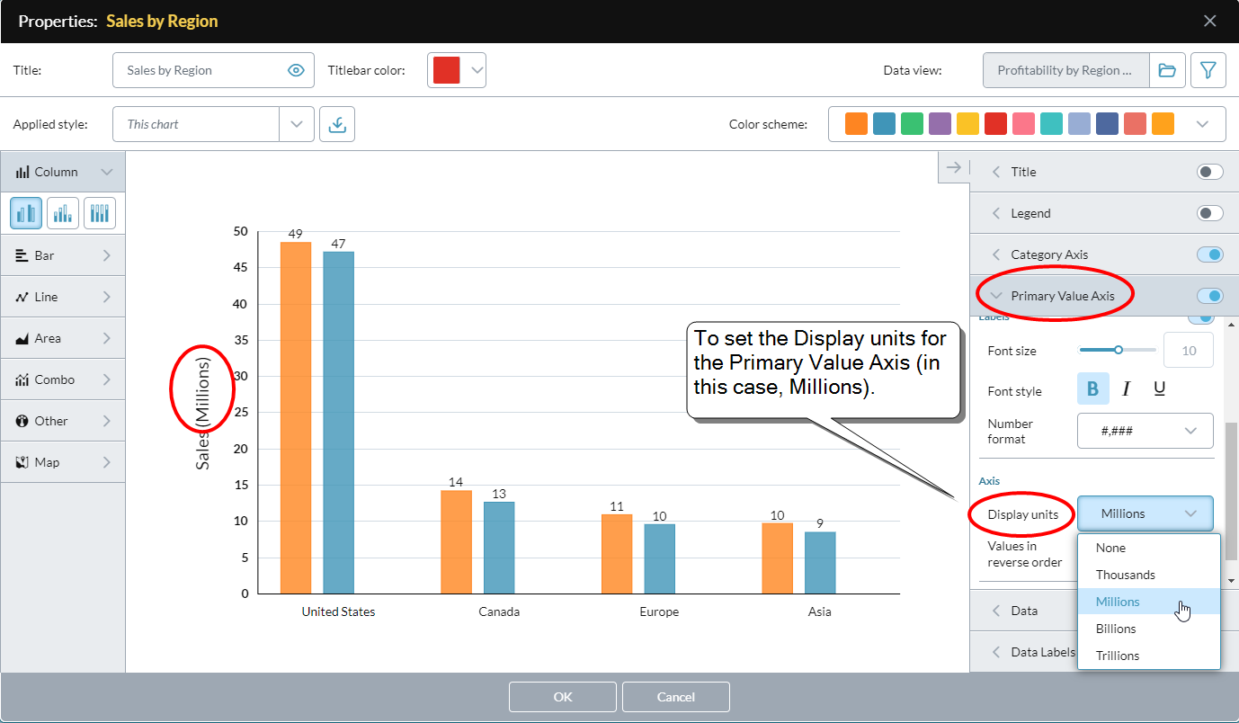
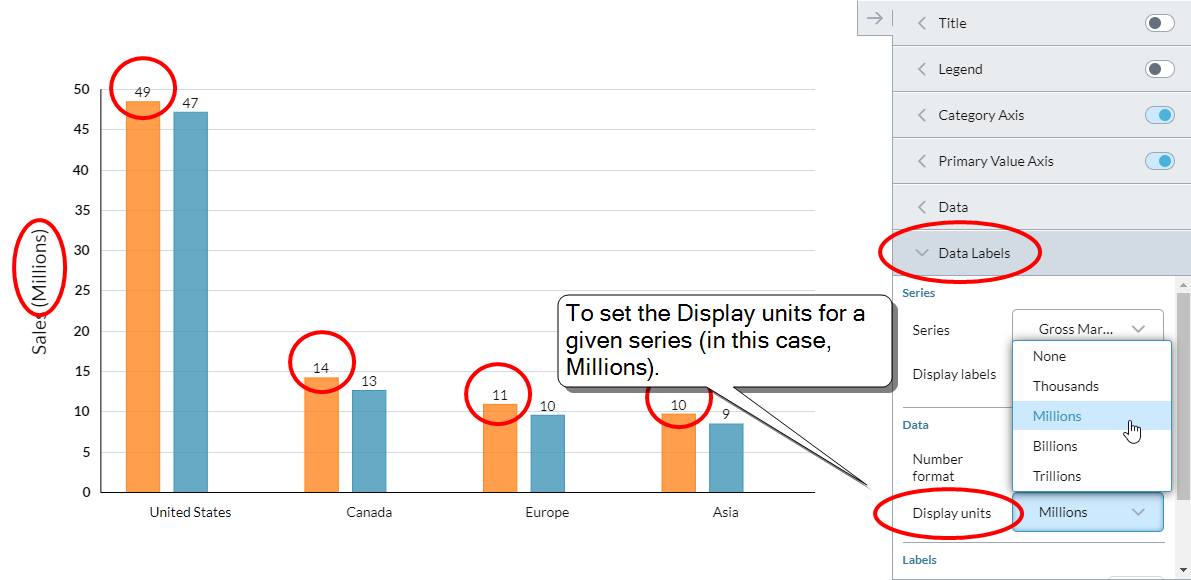
Set display units
In all chart types (excluding Gauge and Bullet) you can use the Display units property to set the scale at which values are shown.
- In all chart types (excluding Gauge and Bullet) you can use the Display units property to set the scale at which values are shown.
- The options are None, Thousands, Millions, Billions, and Trillions.
- The Display units property is available for the Primary Value Axis, the Secondary Value Axis, and for each Series in an axis.
- You can set the Display units individually for each series.
To set the display units for an axis
-
In the properties panel, open the axis drawer (for example, Primary Value Axis).

- To have the display units shown in the label for the axis (for example: Sales (Millions)), turn on Title.
- To apply the display unit setting to the axis value labels (for example: 10 instead of 10,000,000, turn on Labels.
- Under Axis, from Display units select an option (for example, Millions).
- Click OK.
To set the display units for a series
-
In the properties panel, open the Data Labels drawer.

- Select the Series.
- Turn on Display labels.
-
Under Data, from Display units select an option (for example, Millions).
Tip:You can set the Display units individually for each series.
- Click OK.
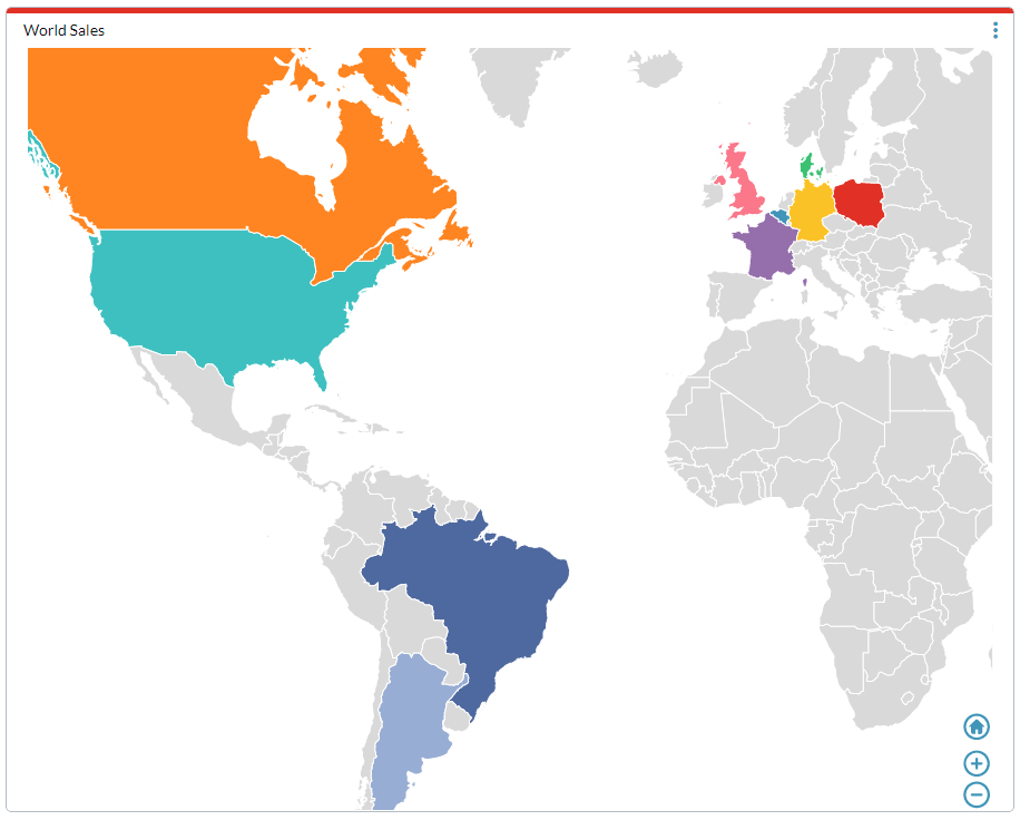
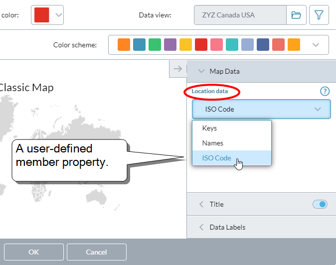
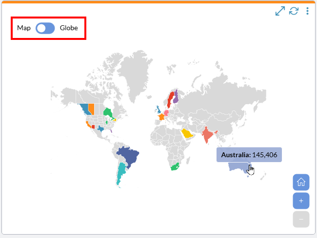
Add the location data for a map chart
Map charts show how a measurement varies across geographic areas.
Note: To use map charts requires adding ISO codes to the model.
When defining a chart tile, after selecting a map chart type, do the following:
-
Open the Map Data drawer:

-
From Location select the member property that contains the ISO codes.
The map immediately colors all regions that have an ISO code defined in the member property:

- Click OK.
Save the chart's style to a style file
- Beside Applied Style, click .
- Type a name for the chart style, and click OK.
Load a style from a file
- From Applied Style, select Open Style,
- Select a style file, and click OK.
Revert to the default style
- From Applied Style, select Default.
Chart tiles FAQ
Do the permissions assigned to users affect what they see in charts?
Yes. When a chart opens, it shows the first page/member combination that the user has been granted permission to see, regardless of what the source data view contains.
What are the chart limits for series?
- Most chart types can have up to 26 series.
- Pie and funnel charts are limited to seven series.
- A gauge chart can have up to two series.
What are the chart limits for categories?
- Column, line, and area charts can have up to 52 categories.
- Bar charts can have up to 26 categories.
- A gauge chart can have only one category.
- A pie chart does not have categories.
What are chart styles?
The look of a chart can be saved to a Style file. This allows you to quickly apply the style to a chart, and to easily re-use it among charts. If you have made no changes to the style of a chart, Applied Styles contains Default; after you make any change, it reads This Chart.
Note: To see chart style files, you need to have Template Studio function access.
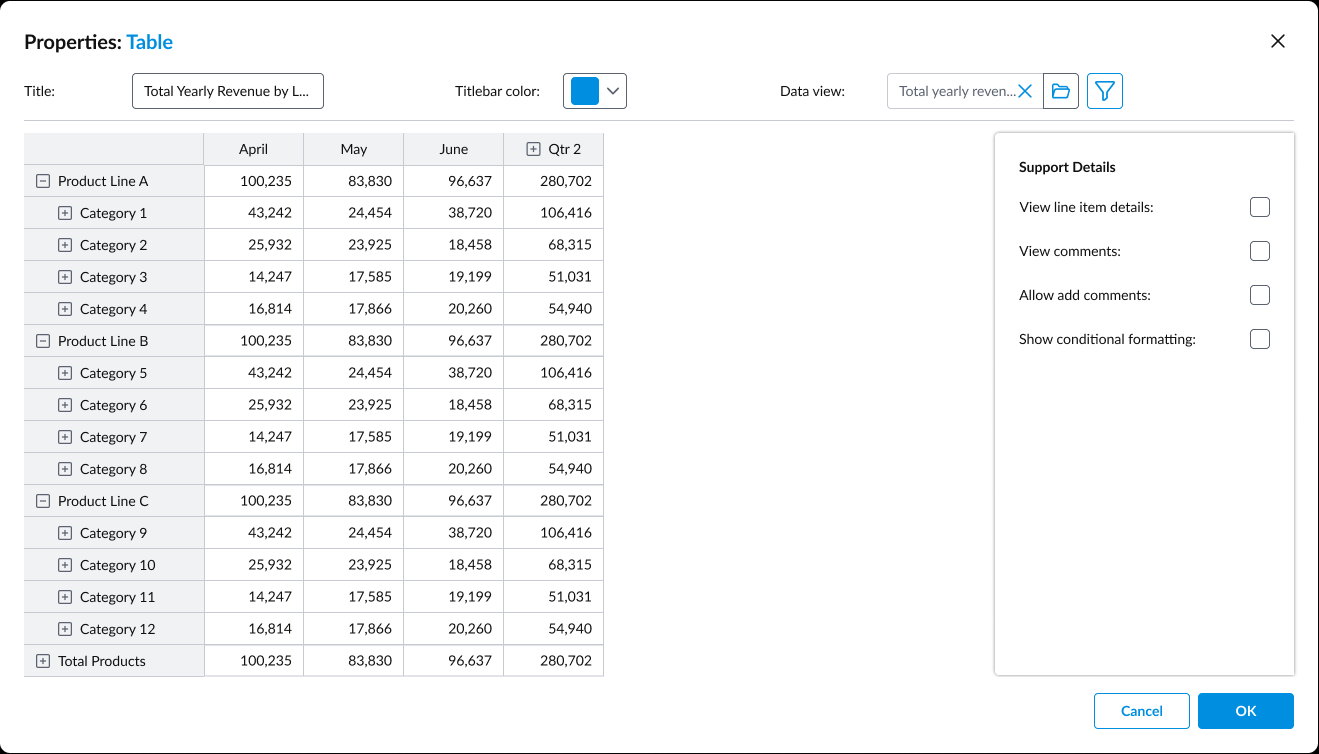
Table tiles
New! A Table tile shows a custom table derived from a data view.
Best Practice: To ensure dashboard loading performance, Prophix recommends that your Table tiles use relatively small data views. For example, the data view should have fewer than 40 columns and 50,000 rows. If you need to use anything larger, we recommend hiding the Formula Bar.
Define a Table tile
- At the tile's top-right corner, click .
- Type a Title for the tile and select a Titlebar color.
- Connect the table to its data source: click and select the data view. The table is immediately drawn.
-
Optionally, to apply filters to limit data (for example. by department, region, or time period), click and select the dimensions to filter by.
-
To allow users to see relevant supporting details, turn on either or both:
- View line item details
- View comments
-
To allow users to see highlighted variances, thresholds, and so on, turn on Show conditional formatting.
-
To make the Formula Bar appear, turn on Show formula bar.
-
Set row limits to improve performance on large datasets.
-
Click OK.
Link a template to a table (Optional)
Optionally, a table can be linked to a template file. The dashboard user can open the template to see a formatted report and gain context.
-
At the tile's top-right corner, click .
- Click and select the template.
-
Map the page members.
For each member, choose one of the following options:
-
Use defaults
The template uses its own built-in logic to determine what member to select.
-
Runtime Selection
The template selects a member based on what the user has selected in the chart.
-
Specific Member
The template uses the member that you specify. Click and select the member.
-
- Click OK.
Assign dashboards
Administrators use Dashboard Studio to assign dashboards to individual users or to groups of users. After dashboards have been assigned, they become part of the home page to those users or groups.
A group or user can be assigned up to five dashboards. The dashboards appear in the Dashboards tab as sub-tabs.
Open the Assign Startup Dashboard(s) dialog
- In Dashboard Studio, click Assign.
Assign dashboards to a user or group
- In Dashboard Studio, click Assign.
- Select a sub-tab: Groups or Users.
-
In the sub-tab, select the group or user.
The group or user's assigned dashboard(s) appear in the panel on the right side.
-
To assign a dashboard, click , browse to the dashboard file, and click it.
The dashboard's name is added to the panel.
Tip: To assign multiple dashboards from the same folder, select the file check boxes.
- To set the order of the dashboard sub-tabs in the user's Dashboards tab, use the arrow buttons.
- Click Save.
Override a user's group dashboard assignments
You can leave a user in their group but replace the group dashboard set with a custom set.
- In Dashboard Studio, click Assign.
- Select Users.
-
Select the user.
The Derived From column shows either the group name or the number of groups that the user belongs to.
- In the right panel's lip, click , browse to the dashboard file, and click it.
- Click Save.
Prioritize groups
The higher a group is in the list, the greater its priority when dashboards are assigned to users.
-
In the Groups tab, select a group and click or .
Note: If a user belongs to more than one group, the user is assigned dashboards mainly based on group priority. For more information, see this entry in the FAQ that follows this section.
Assignment FAQ
When a user has more than one dashboard, which is assigned?
Dashboard assignment uses the following rules:
- A direct assignment (made in the User tab) supersedes any assignments made to the groups the user belongs to.
- If the user has no direct assignment, then the dashboard(s) of the group(s) the user belongs to is assigned.
- If the user has no direct assignment and does not belong to any group, the Welcome Dashboard is assigned (a built-in default dashboard).
What if a user belongs to more than one group?
If a user has no direct dashboards assignment and belongs to more than one group, dashboards are assigned as follows:
- Assign all the dashboards from the user's group that has the highest priority.
- If this does not result in five dashboards, dashboards are assigned from the user's next highest group.
- Assignment continues from the user's groups until five unique dashboards have been assigned or the user runs out of groups.
- Only unique dashboards are assigned (any duplicates are excluded).
A user belongs to three groups that contain only unique dashboards and are prioritized as follows:
- Group A: two dashboards
- Group B: one dashboard
- Group C: four dashboards
When dashboards are assigned to the user, the resulting set is comprised as follows:
- Group A: both dashboards
- Group B: the single dashboard
- Group C: the first two dashboards (the assignment process ends when the total reaches five)
How is group priority determined?
The higher a group appears inside the Groups tab, the greater its priority. The administrator sets the priority.
What if a user or group has no dashboard assigned?
They are assigned the Welcome Dashboard, a built-in default dashboard. This assignment also happens automatically if you delete the custom assignment.
Note: The Welcome Dashboard cannot be edited or deleted.
What is the purpose of the Derived From column?
It lets you see at a glance how the user received their dashboard assignment (and reflects the result of applying the assignment resolution rules, if that was necessary).
In the Assign Startup Dashboard(s) dialog, the Derived From column appears in the Users tab, and always shows one of the following:
-
Custom(s)
The dashboard assignment was made directly in the User tab.
-
Group Name
The dashboard assignment was made through the user's group membership.
-
Welcome Dashboard
The default dashboard has been assigned (the user has no direct or group assignment).