Terms used in charts
Some of the parts of a typical dashboard or template chart:
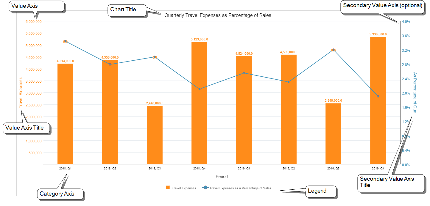
Some definitions:
-
Data point
A single unit of data, usually corresponding to a single cell in the template or one of its data views. Depending on the chart type, each data point is depicted as a bar, column, line marker, or pie slice.
-
Series
A set of data points. Depending on the chart type, each series is depicted as bars or columns of the same color, or a single line. (Note that a pie chart can only have one data series.)
-
Category Axis
Organizes the thing that you want to measure, typically appears as text or date/time periods, and can be either horizontal or vertical, depending on the chart type.
-
Primary Value Axis
Is always perpendicular to the category axis, measures the items in the category axis (and therefore typically is numeric), and can be either horizontal or vertical, depending on the chart type.
-
Secondary Value Axis
(Optional) Measures a second data series, and is set parallel to the Primary Value Axis.
-
Legend
Provides the name of each data series and shows its graphic indicator (for example, blue bar, red line, orange pie slice).