Waterfall charts
A waterfall chart shows the net effect of a series of positive and negative values introduced one after another. The values appear as columns that are color-coded to clearly identify whether they are positive or negative. The first column shows the starting value and the last column the ending value, and they typically start on the category axis. The columns in between show the contribution of intermediate categories or periods, and are "floating columns".
A waterfall chart plots the first column of its data view starting with the first value from the category axis and with the remaining values floating.
A typical use case for a waterfall chart would be to plot columns for the Revenue, Cost of Goods, Gross Margin, Administrative Expenses, and Net Income accounts, with the first and last set as Totals.
Note: Waterfall charts do not support drilling or chart insights.
Set up
A waterfall chart has most of the usual chart properties, along with several unique ones located in its Data drawer:
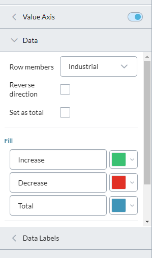
To set up a waterfall chart you change these properties in its Data drawer:
- Row members: Select a member to change it from a floating value to a Total, by changing its Set as total property.
- Reverse direction: If turned on, the selected member in Row members changes direction.
- Set as total: If turned off (the default) the selected row member functions in the chart as a floating value; if turned on, the member functions as a Total and starts from the category axis. (Normally you want to turn on this setting for the first and the last columns.)
- Fill: Set the labels and colors you want for indicating positive, negative, and total values.
- Show connectors: Turn on connectors that tie the end of a column to the beginning of the next column.
- Show arrows: Turn on direction arrows that show the "flow" of the column's value in relation to the previous column.
Best practices
Waterfall charts can be used to present either of the following cases:
- To explain a specific development that occurred to multiple items within a single period.
- To explain a change to a single item over mutiple periods.
These two cases require different approaches to set up, as described in the sections that follow.
Single-time-period chart
This waterfall chart attempts to explain a specific development to multiple items within a single time period.
In this case, when building the data view, the cell values need to be signed:
- If there is a gain or an increase, then the cell value is positive (+)
- If there is a loss or a decrease, then the cell value is negative (-)
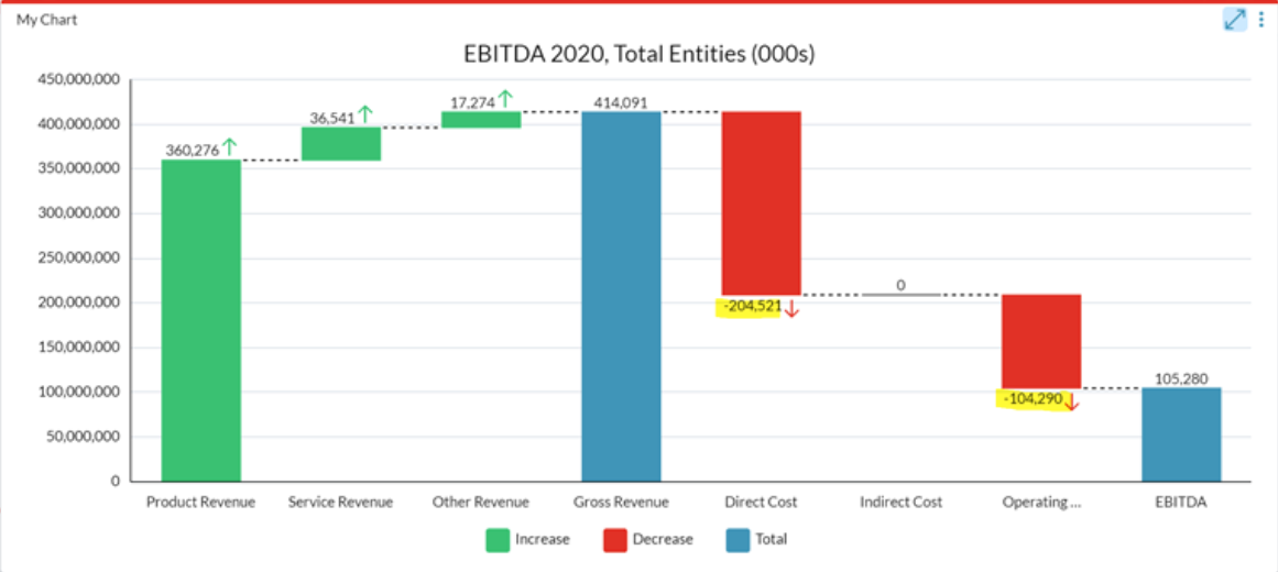
Note: When financial data is loaded, both credit and debit balances are saved as positive values. Therefore, in order for the waterfall chart to accurately reflect the increases and decrease in the data, in the Data drawer turn on the Reverse direction option for each account that needs to have its sign reversed.
In creating a waterfall chart for EBITDA, for the two expense account members only, in the Data drawer you would turn on the Reverse direction option:
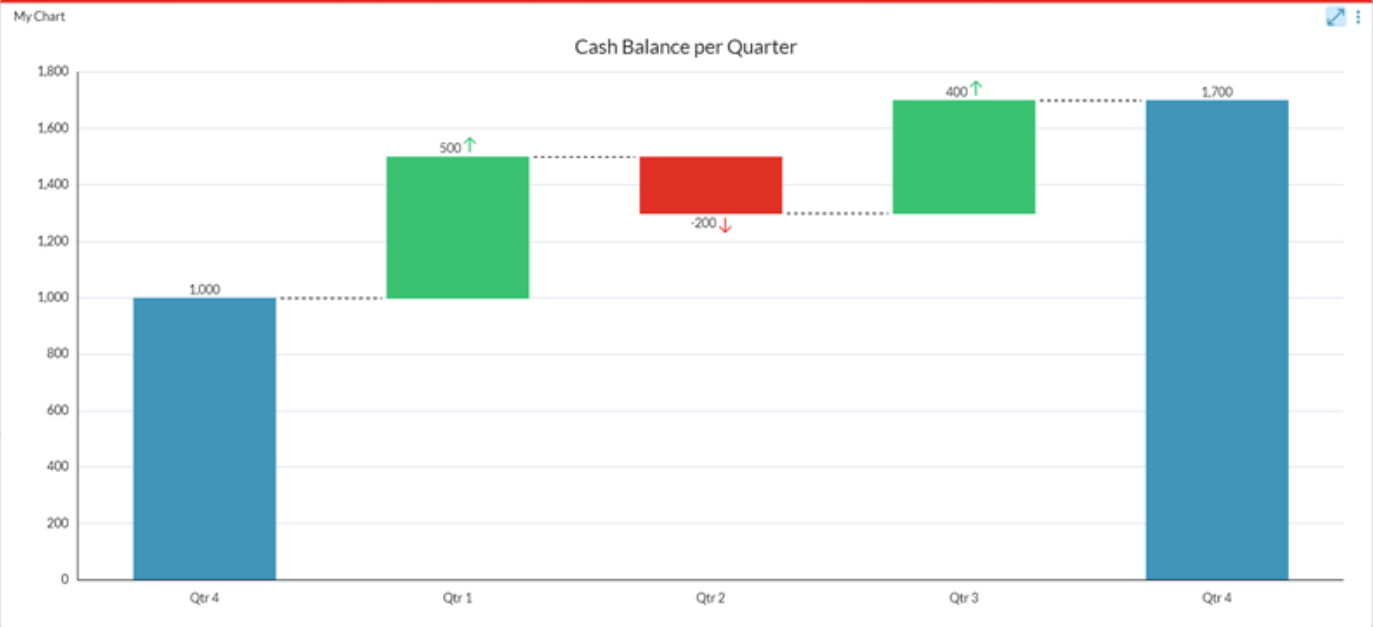
Multiple-time-periods chart
In this case, the chart depicts the changes to a single item over multiple time periods.
The changes need to be captured in the data in order to accurately present it using a waterfall chart.
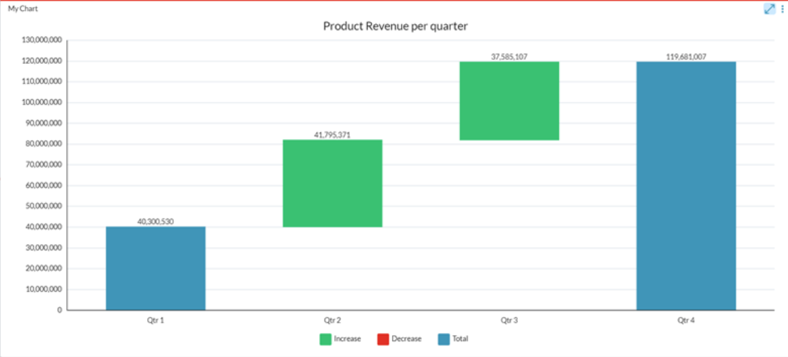
The following chart shows the changes to Product Revenue through the year:
The following chart shows the changes to Cash Balance for each Quarter: